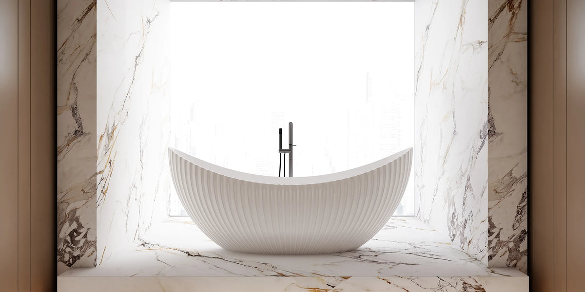
Lifestyle
Warm Minimalist Bathrooms
Explore warm ivory, soft greige and earthy beige palettes for a minimalist bathroom with restrained textures, clear forms and practical everyday use.
At a glance
A warm minimalist bathroom combines simple forms with a considered balance of tone and texture. It can feel calm without looking empty, and soft without relying on decoration across every surface.
Begin with a restrained palette, then use small differences in lightness, texture and outline to give each element definition. The three palettes below are design references, not official MonBlari finish specifications.
Build a Foundation With Warm Neutrals

Cream, oatmeal, sand and warm grey offer different starting points. Instead of using exactly the same beige throughout, compare undertones and vary the lightness of adjacent surfaces. A pale fixture can remain distinct against a slightly deeper wall.
Avoid making every surface equally noticeable. Decide whether the floor, wall or fixture will carry the strongest texture, and keep the other large areas quieter.
Balance Soft Surfaces With Clear Forms

Matte or softly textured architectural finishes can reduce sharp reflections, while a mirror or small metal detail provides contrast. Choose finishes from actual samples rather than assuming a product’s surface treatment from a photograph.
Shape also matters. A clear basin edge or rounded bathtub can provide interest without adding another pattern. Keep useful storage in the plan so that everyday belongings do not overwhelm the quieter surfaces.
Palette 01: Warm Ivory

Palette colors: Cream, Ivory, Limestone, Sand and Brass.
Consider warm off-white walls, a subtly patterned stone-look floor and a pale fixture. A small brass-toned detail can add contrast. Limestone and Brass here are palette labels, not claims about the materials of the pictured products.
Keep enough tonal separation between the fixture and its background for the outline to remain visible. You do not need bold contrast to make a simple form readable.
Palette 02: Soft Greige

Palette colors: Greige, Taupe, Off-White, Stone and Graphite.
Use greige or taupe for the architectural background, off-white for a lighter focal piece, and graphite sparingly. Check that the selected grey and beige undertones work together in the room’s lighting.
If a fixture has pronounced grooves, keep nearby wall surfaces smoother. A single area of repeated detail can provide rhythm without turning the whole room into a pattern.
Palette 03: Earthy Beige

Palette colors: Sand, Beige, Clay, Stone and Bronze.
Start with sand or beige surfaces and introduce clay or bronze-toned accents in smaller amounts. Choose one broad plane for the most noticeable texture, then simplify the remaining surfaces.
A geometric or curved fixture can both work here. Focus on its relationship to the surrounding tones rather than requiring a particular collection or material.
Leave Space Around the Main Form

Visible wall and floor space can make a sculptural piece easier to appreciate. This is a visual principle, not a substitute for checking the actual installation and access requirements.
Choose accessories that serve a purpose and keep frequently used items within reach. Warm minimalism should remain practical after the room is in daily use.
Check the Palette Before Committing
Look for three common issues: surfaces so similar that they lose definition, undertones that feel disconnected, and too many strong textures in one view. Adjust one element at a time instead of adding more materials to resolve the mismatch.
Review physical samples under the bathroom’s daylight and artificial lighting where possible. Keep the palette simple enough to feel coherent, with enough variation for individual surfaces and forms to remain distinct.