Lifestyle
How to Style a Colorful Bathtub
Explore tonal greens, quiet neutral backgrounds and playful contrasts, with three inspiration palettes for styling a colorful bathtub.
At a glance
A colorful bathtub gives a bathroom a clear point of interest. The surrounding walls, flooring and accessories can either support that color or compete with it. Begin with the bathtub, then decide how much contrast you want around it.
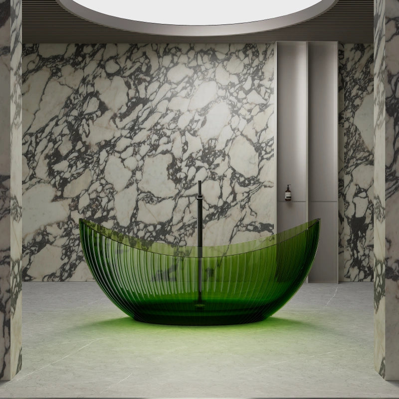
Three approaches offer useful starting points: related shades within one color family, a quieter neutral setting, or a measured contrast. These are design ideas rather than specifications for the colors or finishes available on a particular product.
1. Build Depth Within One Color Family

A tonal palette uses differences in lightness and intensity to keep similar colors distinct. A vivid green bathtub can sit against quieter sage or olive walls, while a pale floor gives the eye somewhere to rest. The surfaces do not need to match exactly.

Palette colors: Olive, Sage, Mist, Chalk and Stone.
Use a muted green for a broad background, a paler tone to separate surfaces, and the strongest green as the focal accent. The color names describe the inspiration palette, not orderable product finishes.
Texture creates another layer of contrast. Keep the larger surfaces restrained when the bathtub already has strong ridges or a distinctive outline. Similar colors can still feel busy if every nearby surface has a prominent pattern.
2. Give the Color a Quiet Background
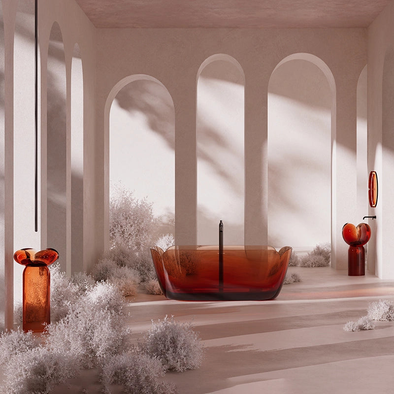
Warm white, sand and muted stone tones can provide a calmer setting for an amber or richly colored bathtub. Neutral surfaces can still have subtle variation; the important question is whether they support the focal color.

Palette colors: Warm White, Sand, Beige, Stone and Amber.
Let the lighter neutral tones occupy most of the room. Use amber as a concentrated accent, with only a few related details elsewhere. Avoid assuming that every beige will have the same undertone.
If a wall has expressive veining, consider a quieter floor and fewer decorative objects. Color, pattern and shape all contribute to visual emphasis, so assess them together rather than treating the palette as an isolated decision.
3. Introduce Contrast Selectively
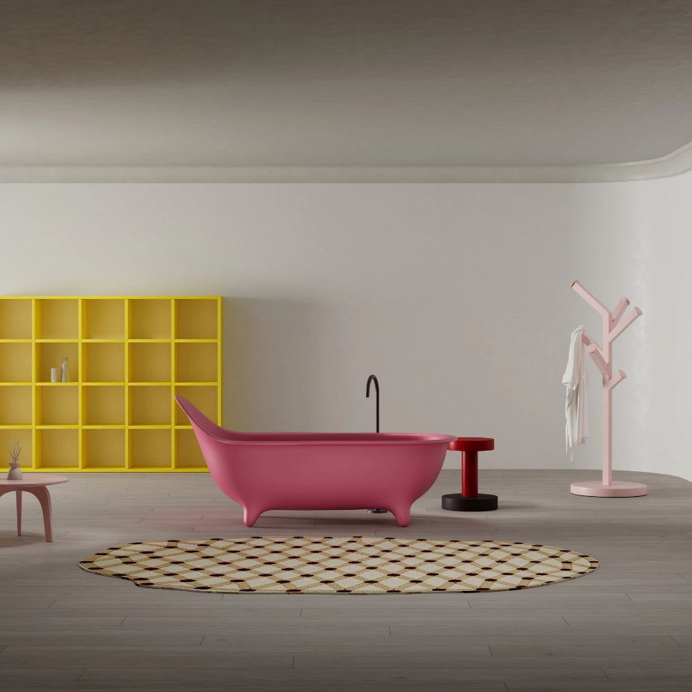
A contrasting accent can make the composition more expressive. The pink bathtub and yellow shelving shown here demonstrate the idea without requiring every wall to carry a vivid color. Choose one leading accent, then introduce another in a smaller area.

Palette colors: Rosy Pink, Coral, Powder Blue, Cream and Butter Yellow.
Treat these colors as a menu, not a requirement to use all five equally. Pink can lead, cream can provide breathing space, and yellow or powder blue can appear selectively in furniture or accessories.
Control both intensity and proportion. A small bright detail may attract more attention than a large muted surface. If two colors compete, reduce the area or intensity of one before adding more finishes to connect them.
Connect Walls, Floors and Accessories
Walls establish the backdrop and flooring grounds the composition. Repeat a related tone through a towel or small accessory if the room needs a connection, but avoid matching every object. Keep the bathtub’s outline visible.
Metal finishes are another part of the palette. A warmer metal may echo amber or earthy tones, while a cooler finish can introduce contrast. Neither is a fixed rule: compare the selected finishes together.
Review the Palette in the Actual Light
Colors can look different as daylight and artificial lighting change. Where a surface appears translucent, its background and the direction of light can also affect the impression. Photographs and screen colors are starting points, not reliable proof of an exact match.
Compare paint and tile samples in the room where possible, and confirm available product finishes separately. A balanced scheme gives each color a role while leaving enough quiet space for the bathtub to remain the focal point.